


Learn Sections Pro
Building a banded page with SectionsUsing Margins and Padding
Sections is a very flexible and easy to use stack. It does also allow you to achieve some quite complex effects.
The key to understanding how overlaying works lies in the understanding of simple margins and padding. You can alter the height of a section by applying padding inside it. You can alter the vertical offset of a section by changing its top margin (including to a negative value in order to shift it up over the section above)
You can also apply negative bottom margins if you wish in order to allow content below to overlap the bottom of a section.
Remember that the section background and its content (the stacks drop zone) can be moved independently. Using the Background Top: setting in Sections - Settings you can move the content (i.e. stacks that you have put in the drop zone) up and down relative to the section background.
This page shows a lot of angled Sections but these instructions apply equally to horizontal Sections.

Don't forget for super simple transparent arrows you can use the Sections Mask stack.
Mask will not however create overlapping arrows and connectors.
This is all CSS, no JavascriptSections does the hard work with a low overhead
All the automatic settings for margins, padding and connectors at various angles and layouts are all fully CSS based. Sections uses ZERO JAVASCRIPT for these layouts.
What this means is that you wont get a flash of unstyled content while your page JS fires up, everything is set up ready to go as soon as your page CSS loads from your server. Using CSS proportional units and the CSS calc() function, everything can be automated.
As you will see below, even these complex setups just require you to change 2 or 3 settings to Auto and tell Sections which stack should appear in front of another with a simple Priority control.
You will also notice that we have used a background gradient here, The examples with arrow connectors show how the arrows automatically take on the color of the appropriate end of the gradient where possible.
The Structure of a Section
In a simplified form a section consists of the wrapper on which the background resides and its content which contains any stacks you drop into it.
In order to see where the stacks content is in relation to the sections background, the content is surrounded by a light blue border. For the purposes of this demo page, the stacks border setting has simply been turned on for the Paragraph Pro stacks used. This allows you to see where the content bounds are and how Sections Pro automatically pads content to ensure that it remains inside angled sections
The content comprises any stacks that you drop into the Sections stack drop zone.
The picture on the right is the basic layout of all the stacks below as setup in edit mode.
In order to show the effects of margins, There is a simple column above and below the Sections Pro stack with top and bottom borders in red respectively. This shows you where the stacks above and below a section are and how the section and/or its connectors can be made to overlap.
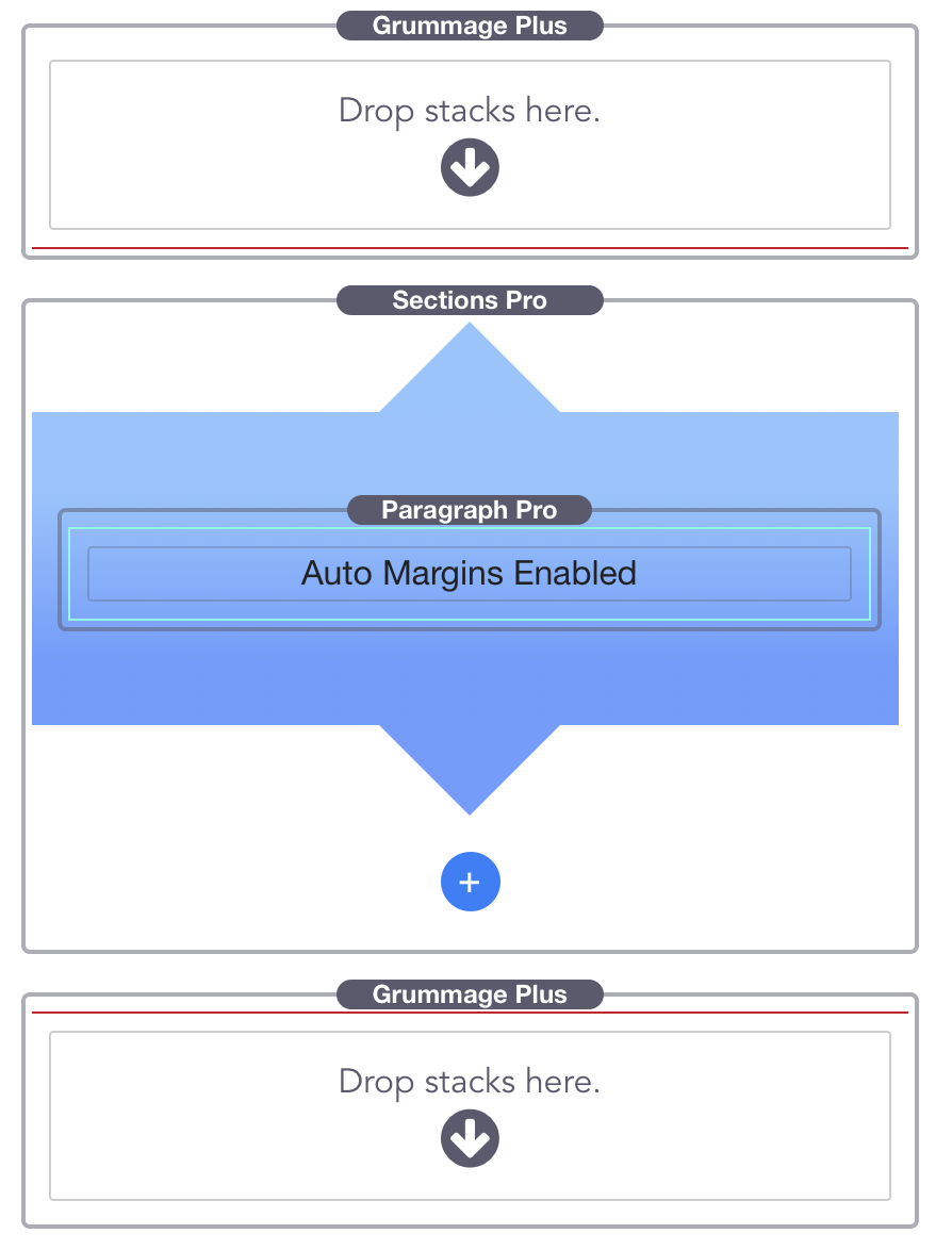
Auto MarginsUsing Auto Margins with Connectors
On the left we have a section in its default state. With Margins turned off, the connector is outside of the main body of the section and is overlapping the stacks above it. Notice how the red line, from the stack above is covered by the section connector and that it extends into this paragraph text.
On the right Auto top and bottom margins are enabled and so there is a gap above the stack. The auto margins account for the space required by a connector and also provide a normal spacing with the stack above it if the section is angled.
When using connectors you need to decide whether you want the connector to overlap the preceding an following content. Sometimes this is desirable, such as when coloured sections are abutted and the arrows should overlap. Other times you don't want the overlap and so just switch margins to auto.
Auto margins will always prevent overlaps regardless of the size of the connector or the angle of the section.
This line is the last text line of the Paragraph stack just to demonstrate the overlap.
No Margins Enabled
Default state
Auto Margins Enabled
Use with connectors to stop overlaps
Auto PaddingKeeps content positioned
Auto Padding Enabled
Default state
Here we can see the Automatic Padding.
Sections has advanced automatic padding so that the content is contained within the background even when you apply an angle to the background.
The only change in the stack settings was the angle. The padding settings are left in Auto mode.
Sections has automatically padded the height of the background to ensure that our content is fully contained within it.
Top and bottom margins are set to Auto - so the stack automatically makes enough space for itself to stop the angled background overlapping the stacks above and below
Auto Padding Off
Note the overlap
Now with automatic padding switched off.
The angle of the section means that the content is outside of the background and doesn't look great.
When using angles, you can either use auto padding or manually pad the content to your requirements.
Sometimes overlapping content is however useful. If you have a subtle series of angled background colors, having content overlap from one to the next can break up the rigid structure of the page and bring interest.
Making Adjoing Sections with AnglesUse the margin controls to your advantage
In the auto margins description above, we saw how by turning off the top margin, a connector can overflow the stack content above it.
The same is true with angles. With auto margins enabled, Sections Pro will automatically prevent unwanted overlaps as the background of the Section is skewed to the angle.
Auto MarginsPrevent angled Sections from adjoining
Margins Auto
Margins Auto
Margins OffNow they join but the connector is hidden
Bottom Margin None
Priority: 1 (default)
Top Margin None
Priority: 1 (default)
Use Priority to control the stacking orderAllow the connector to show over following content
We saw above that with the adjoining margins set to none, we can make angled sections butt up to each other. The last problem we face is that the arrow connector on the upper blue section is getting obscured by the following blue section.
This behavior is normal as content further down the page will always appear over the top of content that appears before it in the page HTML.
Fortunately, Sections Pro make this easy to control with the Priority setting. This is a simple control that alters the z-index but you don't need to know about that.
All that you need to remember is that Sections with a higher priority will appear above those with a lower priority. Also see the separate page on Priority for more do's and dont's.
So, to make out upper blue sections connector appear over the top of the lower purple section, we just need to give it a higher priority.
By default, everything starts with a priority of 1, by changing the priority to 2 (while leaving the purple section at 1) we will reveal the connector.
Priority Controlling Stacking OrderWe are nearly there now....
Bottom Margin None
Priority: 2
Top Margin None
Priority: 1 (default)
The final stepTurn on auto padding
In the last section, we adjusted the Priority to allow our arrow connector to overlap. The Sections are now joined and looking good but the arrow is overlapping our content. This is an extreme example because the Section is tiny with virtually no content but it does show that we need some padding applied.
This is so simple with Sections, all you need to do is to set the Vertical Padding setting to Auto. Sections calculates exactly the right amount of padding and our layout is complete - as shown in the left hand column below.
Sometimes you may want to achieve finer control of the padding. In which case just set the Vertical Padding to manual and you can fine tune the top and bottom padding for small and large screens using the padding units of your choice, either proportional (%) or fixed units (rem or px).
Bottom Margin None
Priority: 2
Top Margin None
Priority: 1 (default)
Lets make this even easierUse Sections Master Styles
The typical banded page, whether angled or not, will consist of a repeating pattern of Sections with various backgrounds, margins and padding. You can assign each of these settings to a Vault.
A Master Style is a re-usable collection of settings, just like a color swatch but instead of just one color, it has almost the complete set of Sections settings in it.
This means that you can set up a Section once for your page (or site using Partials) and re use it wherever you want by just setting the Section style to that Master Style number.
You can set up Sections Master Styles using the Pro Styles stack and by simply adding a Sections style to it.
See the Pro Styles and Vault information page for more details.