

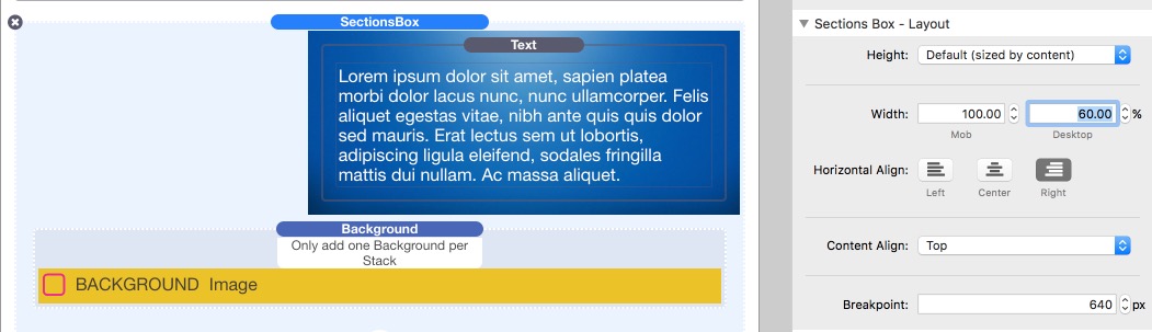
SectionsBox
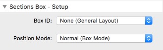
Box Mode

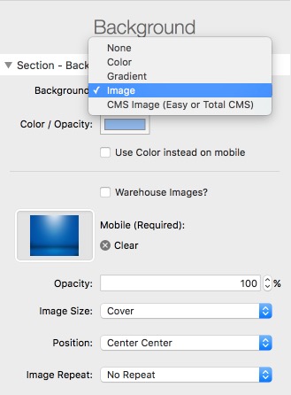
Backgrounds
Use the full range of background types just like Sections Pro including Master Styles.
Quick and easy copy and paste of styles between Sections Box stacks.

Size and Align
Size to browser height with content control, multiple alignment options at the click of a button.
Unique vertical alignments using no complicated translates so content just works.

Quick & Easy
Sections Box mode is the quickest and easiest way to add full width or contained backgrounds to any stack on your page.
Quick, efficient and flexible.
Use SectionsBox in normal box mode to add wide variety of backgrounds to anything anywhere.
Colours, Linear & Radial Gradients (1,2 or 3 color with color stops and angles)
Images (Local, Warehoused or CMS)
Use Master Styles to theme your entire site simply
Flexible padding and alignment tools in a few clicks
Get control of padding, responsive visibility and alignment controls with simple but powerful options.
Extends the default Stacks options with several useful features.
Vertical alignment of anything anywhere.
So long as SectionsBox has a height you can use its vertical alignment feature to align top, vertical center or bottom.
Works in any column stacks.
Ideal when used with Match Heights.
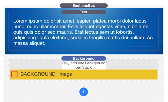
Backgrounds & Overlays
With the position mode setting is set to Normal (Box Mode) Sections Box is just a simple container that behaves just like any other stack.
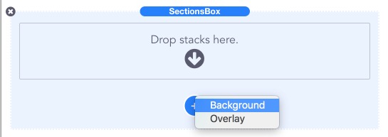
- Add backgrounds and overlays with a couple of clicks including:
- colors
- gradients (2 and 3 color, linear and radial with color stops and angles)
- images (including fixed backgrounds)
- CMS Images
- Control the horizontal and vertical alignment of the content.
- Use the advanced padding controls.
- Use the advanced visibility controls
- Use proportional to browser height
Proportional Height
Sections Box has a simplified version of Sections Pro proportional height settings.
Size the Box proportionally to the height of the browser
Content control, as pioneered by Sections, will prevent content being clipped no matter how tall the browser is.
Find out more about Content Control
- Height proportional to browser:
- Options for mobile and desktop sizes.
- Content control means that stacks will always show
- Powerful alignment options for content
Works with ProStylesFor optimum code efficiency
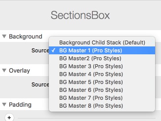
If you are using an background or overlay more than one then use a ProStyles master added from the Prostyles stack.
This will ensure that your page is the most efficient it can be with only 1 set of CSS instructions for all stacks with the same styling.
Sections Box also has its own background and overlay child stacks just like Sections Pro when you need unique backgrounds.
Vertical Alignment(Works with difficult content such as Foundation Clearing Gallery)
Top


Middle


Bottom


Remember to set the Sections Box z-index control to auto when using Foundation Clearing Gallery.
Simple setup images are shown in the gallery
SectionsBOX
/ Think it. Make It.